
The Computational Thinking course at Virginia Tech is organized into 7 modules, with an interesting spiral shaped design of the curriculum. Each of those modules can be seen as a collection of classwork activities, homework assignments, reading quizzes, projects, and attendance grades. Each of these are worth a certain number of points towards the overall final class grade. By the end of the semester, if a student has successfully completed all the assignments perfectly, they will get 100% of these points and get an A. Naturally, most students miss a few assignments here and there, but the vast majority of students still manage to get an A.
Recently, in an email discussion with one of the TAs in the course, an interesting question was poised: what is the distribution of points over the course of the semester? I actually answered this question while creating a graph for my dissertation last year. I ultimately removed the graph from my dissertation, but I think it was too interesting to just throw away.
Explaining the Graph
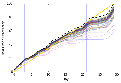
This graph might be a little confusing, so let’s break down its parts:
- The vertical light blue lines divide each module.
- The thick dotted line is the actual number of points possible a student can get. No student can get higher than that line, since there are no extra credit points.
- The thin rainbow colored lines were the students from that semester; you can actually see the students’ trajectories as they accumulated points in the course.
- The straight yellow line is an estimated trend line. It doesn’t have any actual reflection on reality except to point out that each module adds a_roughly_ consistent number of points.
Graph Results
So from this graph, we can see a few interesting things:
- The first module ends up being worth 20%, which is as much as modules 2 and 3 put together. I was initially a little anxious about this, but the TA pointed out that the forgiving spirit of the course allows for students to reach out to instructors to make those points back up. So I think it’s good that there’s a bit of a “wake-up call” for students at the beginning.
- The middle module of the course, where they work on Python, stands out a little as a long module. However, the slope of the line at that point slows down. This module tends to be a little more difficult and programming-oriented than other modules, and I think we have long thought we need to spend time revising that section to make it more digestible.
- In the penultimate module, the course slows down as students work on their final project in class. The only real assignments are some progress report submissions.
- You can see it jump at the end when the final project and final code explanation grades get added.
Conclusion
What did I learn by reviewing this graph? Well, overall, the trend line does not vary too much from the actual points possible - despite some jumps, most of the course is a fairly smooth trip. There seem to be places where we could smooth things out further and make it slightly more consistent. However, I doubt most students would notice such a change.
I think it’s nice to see how so many students get most of the points by the end, and they stay bundled up by the top. It is somewhat amusing (disheartening?) to see the few students who flatline and suddenly jump back up as they ask for assignments to be reopened and scrounge up points. The bulk of the students seem to stay in sync with the assignments, rather than trying to complete everything at the end of a module.
I am surprised that this graph came out as smooth as it did, since I wouldn’t say that we intentionally laid out assignments with this graph in mind. I would be very interested in seeing this kind of analysis performed on other courses. I will certainly be doing so for my Python course, down the road.